
Live Colorfully
Written by Devin Lewis
PANTONE Color of the Year
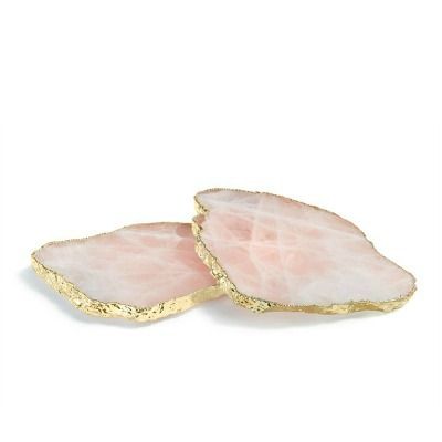
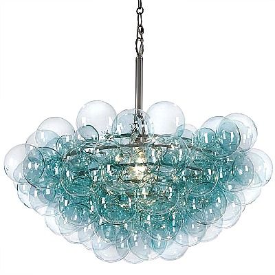
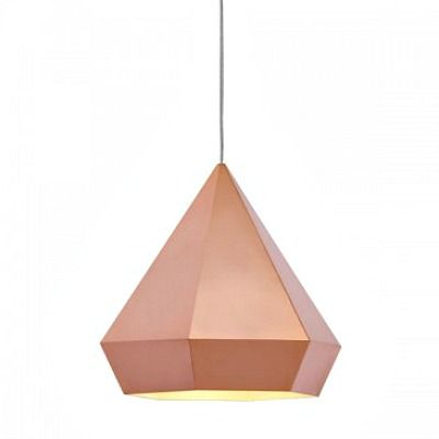
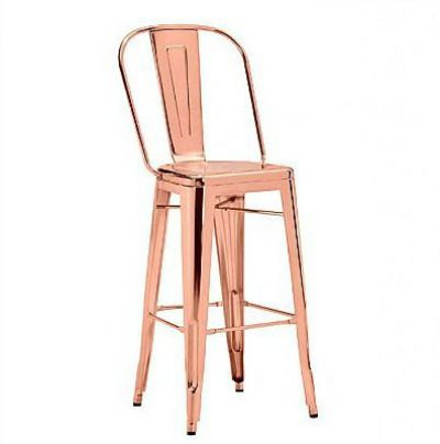
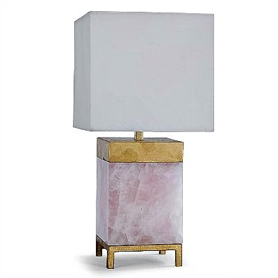
Rose Quartz and Serenity
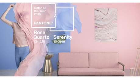
Photo courtesy of eone-time.com
Every year Pantone seeks to pick a color that they believe has been influential on our society and will be present in various trends throughout the year. These trends could be present in all things from clothes to home décor. Determining the color of the year is an innovative way to express what is currently popular in the consumer market and portray that to customers. For the first time since starting, Pantone has chosen two colors of the year, rose quartz and serenity. This color combination is said to, “demonstrate an inherent balance between a warmer embracing rose tone and the cooler tranquil blue, reflecting connection and wellness as well as a soothing sense of order and peace”. Through the use of these colors Pantone is challenging traditional gender roles in the sense that pink is seen as feminine and blue, masculine. Rather than viewing traditional color roles, it is about the feeling that each color emits when on an article of clothing or in a room.
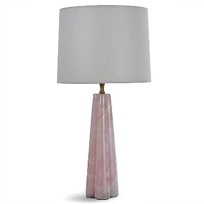
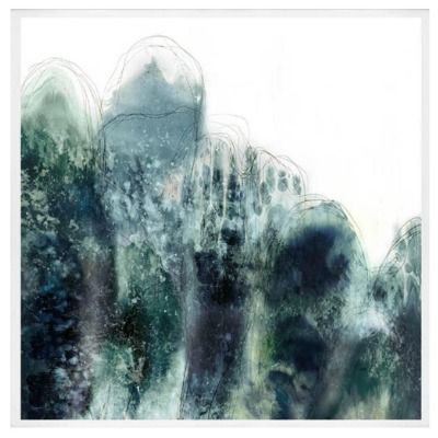
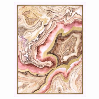
At CGH we strive to keep customers up to date on all trends and offer a variety of products in the pantone colors of the year to help enhance any room in your home. These colors can be combined with an array of others to create unique combinations that will surely be conversation starters in your home. Adding in subtle accessories in different colors is one of the simplest ways to change the appearance of a room. Some bright new pillows scattered across the couch, a new footrest or stool, and a new piece of artwork can transform your room, essential for the change of season that is right around the corner.
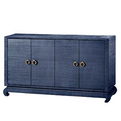
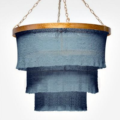
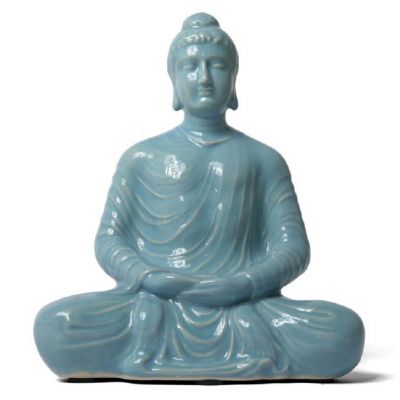
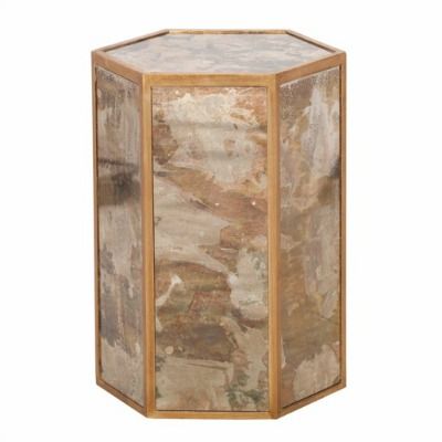
Color is about expression and is a reflection of attitudes and feelings at a given time. The choice of rose quartz and serenity suggests a sense of peacefulness and calmness that is welcome and needed in every room of the house. While the color pairing works well together, they can also be used alone to achieve similar effects. We suggest using accent colors, such as golds with the rose and silvers with serenity, to aid in making the colors versatile for your already existing color palette. The use of accents will allow these colors to blend seamlessly into already decorated rooms in order to ensure a practical use of a trend such as this.
It is important to keep in mind when introducing a new trend into your home that it is done subtly rather than overdone. While these colors are tranquil and soothing, they are in fact, just the color of the year. It is always exciting to partake in trends, especially those that can be achieved as easily as this, but that does not mean that you should compromise your personal aesthetic. Look through our suggestions to find products that will benefit your home and enhance your style while creating a relaxing environment with the use of rose quartz and serenity, Pantone’s 2016 colors of the year.
Leave a Reply